Eliminating the stress of subscription creep through an integrated management tool for Redwood Credit Union

OVERVIEW
As the subscription economy grows, Redwood Credit Union members are increasingly struggling to manage a complex web of recurring charges that often lead to unexpected fees and frustration.
Role
Solo UX/UI Designer
Timeline
February - April 2025 (12 weeks)
PROBLEM
Redwood Credit Unions members are failing to manage recurring payments
54% of members are losing money paying for subscriptions they don't use and are overwhelmed by the cognitive load of recurring payments. While 73% of them want a central way to track and manage these payments, Redwood Credit Union’s current digital tools lack the features to bridge this gap.
SOLUTION
Clarity and control are key
1
Recurring payment aggregator
All recurring payments are categorized
Accounts and amounts easy to view
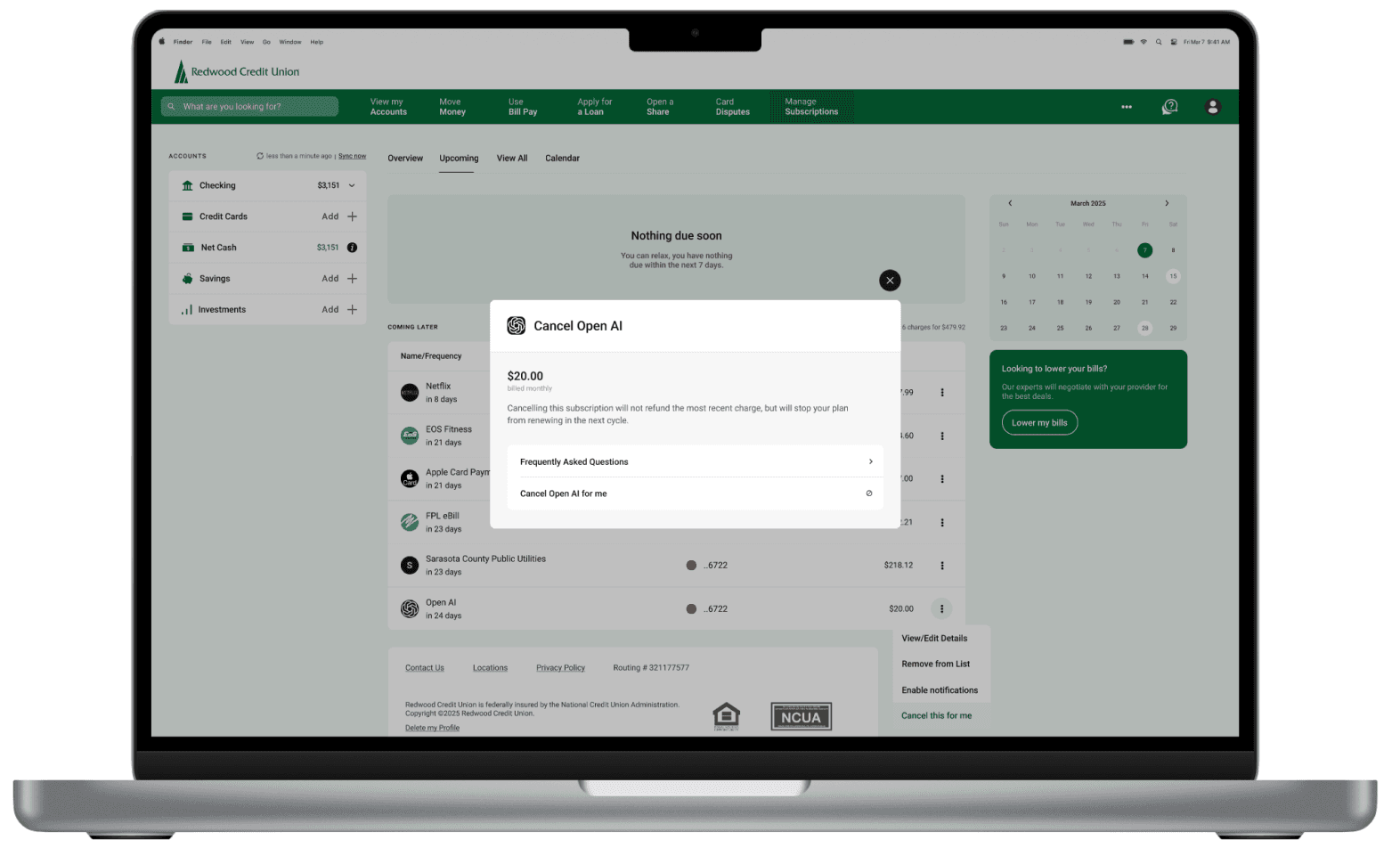
Direct easy cancelation

Direct cancellation made easy
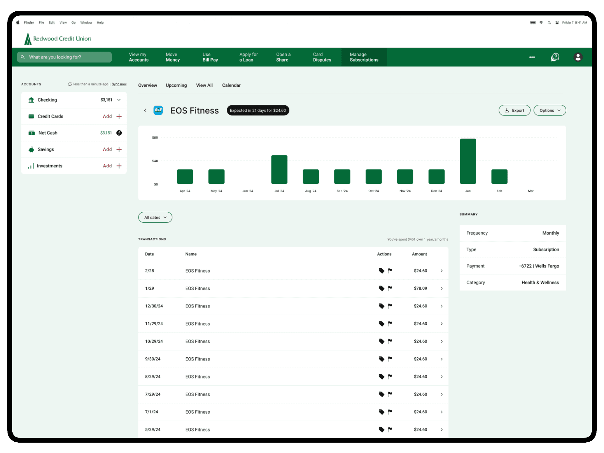
View subscription history and totals spent
Native cancellation or negotiation
Visual spending charts for clarity
2
3
Calendar view for visual clarity
Due dates and amounts mapped visually
Quick actions are easily accessible
Provides users with a sense of agency and control

competitive analysis
Competitors are profit-driven trackers, not native financial partners
Looking at four of the most used subscription apps, I found they offer great features and data, but fail to capture user trust and reduce cognitive load.

Mint

Trim

Rocketmoney

Bobby
user interviews
Members struggle to control invisible costs of fragmented subscriptions
I interviewed 5 RCU members to try and gather qualitative insights about their financial tracking habits, pain points, and expectations.
Research questions:
How do you track your recurring payments?
Where do you encounter the most frustration?
How do subscriptions affect your budget and financial goals?
Are there privacy concerns about flagged data?
What would empower you to feel in control?
The main insight
My interviewees lose financial agency because they rely on mental inventory
Based on the trends in my affinity map, I've noticed how without an organized system, members will just mentally track expenses in their head and react to issues after the damage has been done.
Loss of agency
Members feel a loss of control due to the invisibility of automated payments.
They prefer manual payments for the added security.
Participants universally trust RCU over a third party apps.
Cognitive Load
Mental tracking leads to lack of clarity and constant stress.
They are caught off guard by longer billing cycles and irregular charges.
Checking account summaries can be overwhelming.
Financial blind spots
All members wanted a native tracking tool.
Individual charges obscure totals spent over time.
Without alerts, members continue to pay long after they have forgotten.

the novice gardener persona

28 Years Old | Marketing Coordinator
User Story
Hi! I'm Rebecca. I stay on top of my recurring payments because I prefer manual control, but missing cancellation deadlines is a real pain. I find myself checking my banking app 'an ungodly amount of times per day' just for reassurance. I'm not looking for a complicated new tool to pay for, I just want a simple way to make sure I’m not wasting money on things I don't use.
Goals
Cancel unused subscriptions easily
Less financial stress and worrying
Stay on top of her payments
Motivations
Doesn't want complicated tools
Prefers to manually make payments
She cancels quickly if not finding value
Pain Points
Forgets to cancel free trials
Time consuming to manually check finances
Different accounts paying for subscriptions cause chaos
Feels out of control with too many subscriptions
Testing + improvements
Three major improvements in my design
After two rounds of testing with ten participants, I iterated on the design over the next 2 weeks - with 3 major improvements:

Expanded key actions
Based on user testing 60% of users expected to cancel from the options CTA
Added cancellation and notifications options to the details page
1
2
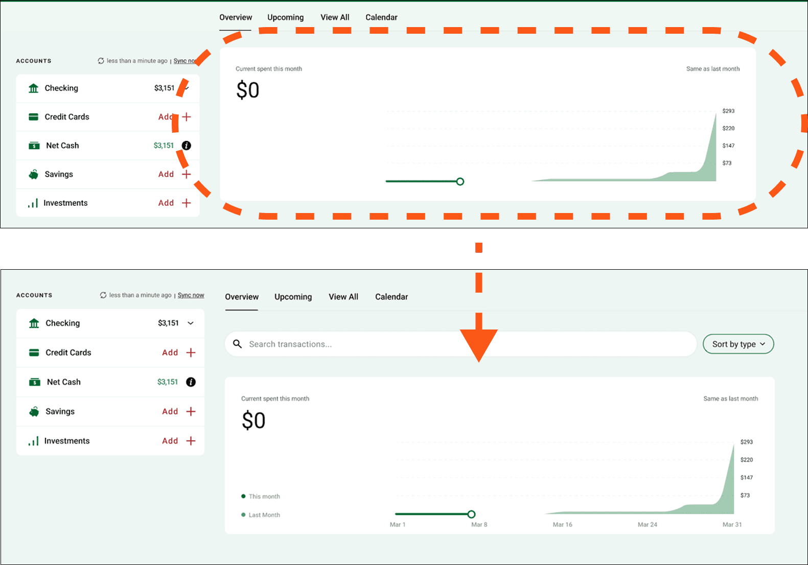
Clarified graph data
Testing revealed that users were unclear about the overview graph
Added more information to the x-axis and labels

Post action confirmation
Users hesitated initially with navigation within the feature
I differentiated the navigation bar to make it more clear
3
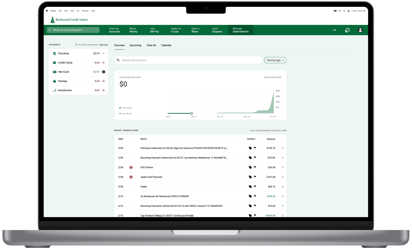
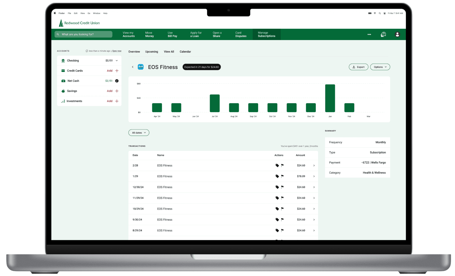
The final screens
The final product

conclusion + lessons learned
The main takeaways from the project
Accessibility is not optional. Testing with a wide range of users (ages 30-75) made me realize that while one group can navigate with ease, others need more visual clarity and simplified navigation.
Data should be actionable, not just visible. Simply seeing charges and aggregated data are nice, but they do nothing to address the key friction of feeling out of control and overwhelmed. Giving users agency through key actions helps solve their underlying anxiety.
Trust is the biggest differentiator. Leveraging the inherent trust that users had with RCU was a major reason for proposing this feature, as it leads to more member retention without privacy friction that third party apps would have.
© 2026 Vincenzo Stornaiuolo. All Rights Reserved.